
CHALLENGE01
Synthesis
Learning the offline workflows
Observation
Understanding the Environment
Each role ran on its own system. Excel, Google Sheets, personal notes, email threads - and no one had access to anyone else's. If you wanted to know what the ensemble was doing in October, you asked someone. The only place it all came together was a shared Excel on a big screen, updated live by hand during the monthly meeting.
So I sat in on that meeting. What struck me was where the time went: most of it wasn't spent making decisions. It was spent exchanging information - piecing the big picture together from scratch, every month.
So I sat in on that meeting. What struck me was where the time went: most of it wasn't spent making decisions. It was spent exchanging information - piecing the big picture together from scratch, every month.
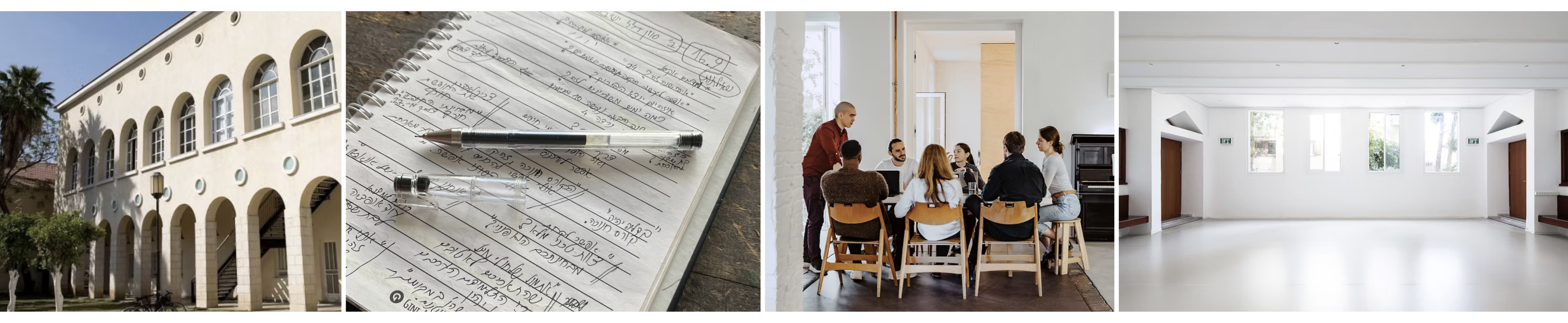
The complete picture existed only in the air during the meeting. The only way to coordinate was through long conversations - not just to make decisions, but simply to establish a shared baseline
Ping moment
It’s a Query Problem, Not a Calendar Problem
Reframe #1
They weren't looking at a calendar. They were asking questions - and doing mental math across scattered information to find answers. Who's in Studio Dalia? Where can Group X rehearse? When does the community event fit? It can't answer any of these. This wasn't a calendar problem. It was a query problem.

Information Architecture
Defining the atoms of the system.
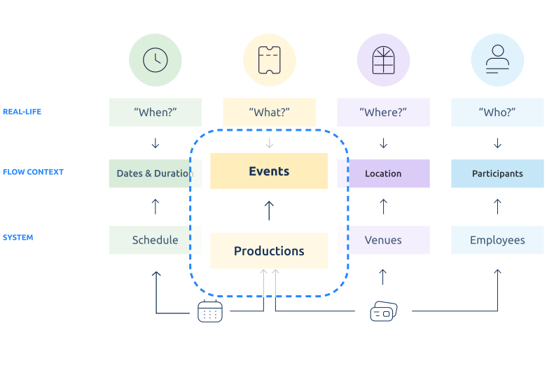
I mapped the questions that came up in the meeting: what types of questions are these? What entities can I derive from them? What needs do they reflect? Who's in Studio Dalia? → there's a "space" entity, a "group" entity, and a time relationship between them. The questions didn't just reveal what the system needed to know. They revealed how it needed to think. The system got its shape from the queries.
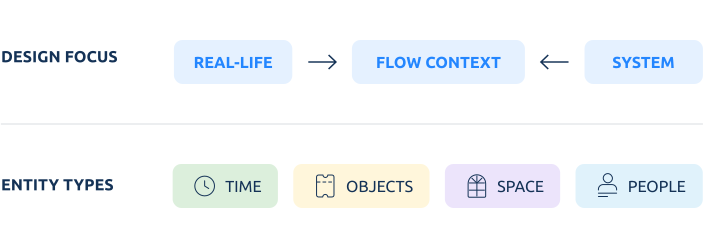
Translating mental models into system entities to bridge the gap between user behavior and database structure, I mapped real-life observations into actionable system entities. By aligning human questions (When, What, Where, Who) with system architecture, I identified a critical dependency between Schedules and Events. This realization shifted the product strategy from isolated data entry forms into an interconnected, context-aware workspace where time and production content are managed simultaneously.
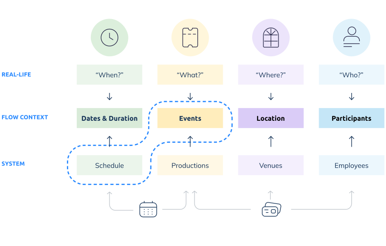
Those queries revealed what the system's building blocks are

CHALLENGE02
Perspective
Context Switching solutions
Ping moment
Moving from infinite scroll to a new perspective
Reframe
One of the clearest requirements was: "We need a calendar with infinite scrolling".Only after watching the meeting did I understand what was behind it. They weren't scrolling - they were searching. Jumping between topics, zooming in and out, switching between a tour in April and a rehearsal next week. Excel forced them to do that linearly. So linear scrolling became their mental model for control
The real need wasn't infinite scroll. It was to jump between topics and time ranges without losing the big picture.
The real need wasn't infinite scroll. It was to jump between topics and time ranges without losing the big picture.
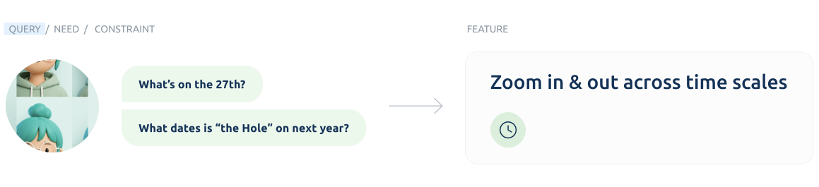
Users were used to working with Excel, which forced a linear mental model, but their coordination was non-linear. Observing their live workflow helped me understand the gap between what they asked for and they actually needed.
Bird's Eye View
What did they actually need
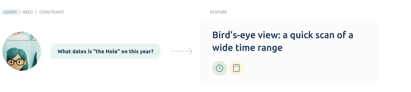
Behind the scrolling habit was a simpler need: to control the timeline. To jump between points of interest without losing your place. The old way meant scrolling back and forth, moving between screens just to reach a different stretch of time - friction at every step. So I designed the Bird's Eye View: a timeline you can scan across months, seasons, and years while staying oriented. You stay in one place and just zoom in and out, from today to four years ahead in a single tap. The back-and-forth is gone, and reaching any point in time becomes part of the flow.
Tentative
There are a lot of 'maybes', but they don't show up

A large part of the schedule wasn't confirmed events. Many bookings were being considered, tracked off to the side, and never showed up on the shared calendar until someone made them official.
But these tentative plans were already shaping decisions - availability, dependencies, routing, staffing. The team was assembling the picture around things that existed everywhere except the system. So that state lived only in people's heads, between meetings.
But these tentative plans were already shaping decisions - availability, dependencies, routing, staffing. The team was assembling the picture around things that existed everywhere except the system. So that state lived only in people's heads, between meetings.
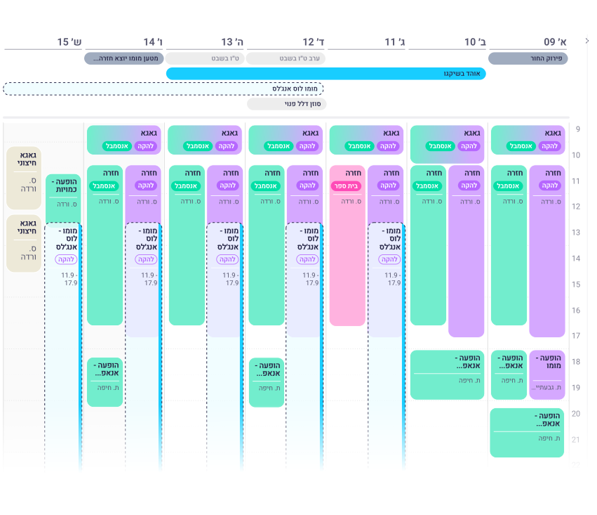
Discussions were mostly about possibilities, not final decisions
I noticed that most of what they discussed wasn't decisions - it was possibilities. "Maybe Los Angeles in April, or Amsterdam in February instead." Nothing landed anywhere. It stayed in the air, or with whoever was directly involved
Uncertainty became an actual entity: for the users it was a transparent stage in the workflow, despite shaping dependencies and planning decisions. I turned it into an defined system state.
Toggle
Toggling between perspectives
In the daily view, "Who's in Studio Dalia?" and "What is Group X doing?" pull in opposite directions. One question organizes the screen around spaces, the other around groups. Instead of building two separate screens, I made a toggle that flips the Y-axis: Display by Group, or Display by Space. Same data, different narrative, one click to switch - without touching the underlying structure.
After mapping their queries, tasks, and questions, a pattern emerged: they all involved intersections of 2-3 entities. Questions like "Who's available in Studio Dalia tomorrow?" require intersections (time × space × people) that the old system couldn't surface. Understanding these intersection points became the foundation for the system architecture.
Joker Filter
"See everything all the time" actually meant "don't let us lose the context"
Users insisted on seeing everything all the time - more than anyone can hold at once. Interviews couldn't pin down what they actually needed on screen. Only watching them revealed it: they dive in and out of specific details constantly, and every time they dropped into one, they lost the wider context. That was the real cost. They didn't need everything active. They needed everything available.
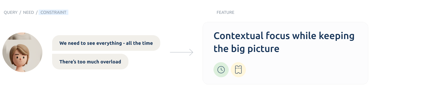
Standard filters made it worse. In a meeting where the topic changes every thirty seconds, checking and unchecking boxes is friction at exactly the wrong moment. So the Joker Filter lets you highlight one query with a single click - everything else stays on screen, just grayed out. You drop into a detail without ever leaving the big picture.
They don't process everything at once - they switch tasks so fast it feels simultaneous. The need was never more data on screen. It was to keep the thread while diving in.

CHALLENGE03
Close Up
Classifying everyday objects
Shared Language
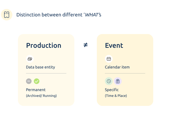
Defining the basics: "Production"≠ "Event"
Building the system from scratch meant defining the core entities first. In Hebrew, the overlap between "Production" (מופע) - the permanent artistic entity - and "Event" (הופעה) - a specific date and venue - caused constant confusion. Get this wrong and the whole data model breaks. We spent real time on definitions like this, not as an exercise, but because the system couldn't work without a shared vocabulary.
Ping moment
The monthly grid dilemma (or: The Production is King)
Hierarchy
The weekly view had room for both - color carried the ensemble, text carried the event. The monthly grid didn't. Compressing everything in created real visual noise. Replacing the color backgrounds with dots saved space but broke the context, and showing only the event type ("Rehearsal") or just the ensemble name left managers with nothing useful to read.
So in the monthly view, the "what" won. Too many items, too many boxes for color to lead. Color stepped back and became an index - a signal, not a label.
So in the monthly view, the "what" won. Too many items, too many boxes for color to lead. Color stepped back and became an index - a signal, not a label.
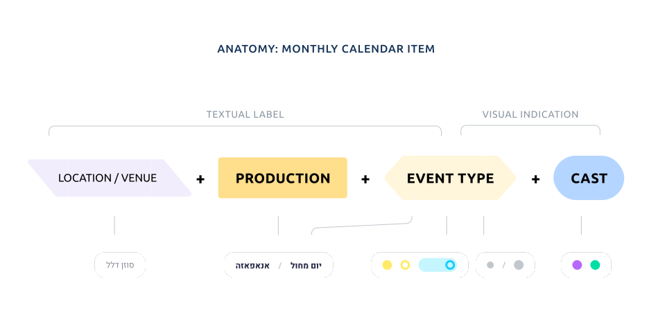
The Production is King. Not the ensemble, not the generic activity - the specific show. "The Hole" became the primary title, and the ensemble dropped to a color dot. To separate a performance from a rehearsal without adding text, I solved it structurally: performances got bold type, a large dot, and a divider line. Rehearsals stayed plain.
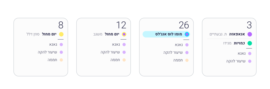
It was tempting to organize everything around the ensembles - they're the heart of the organization. But the ensembles don't perform. The shows do.
First Surprise
How to formulate 20 event types, X 30 variables?
The data audit turned up over 20 event types, each crossing up to 30 variables. The obvious move - a separate template for every type - would have buried staff in forms. So instead of dozens of templates, we looked for the one structural split that actually mattered: point events versus touring events.
The data audit turned up over 20 event types, each crossing up to 30 variables. The obvious move - a separate template for every type - would have buried staff in forms. Working through it with the data engineer, we looked for the one structural split that actually mattered: point events versus touring events. He knew where the data model could bend and where it couldn't, and that shaped which distinctions were worth building around.
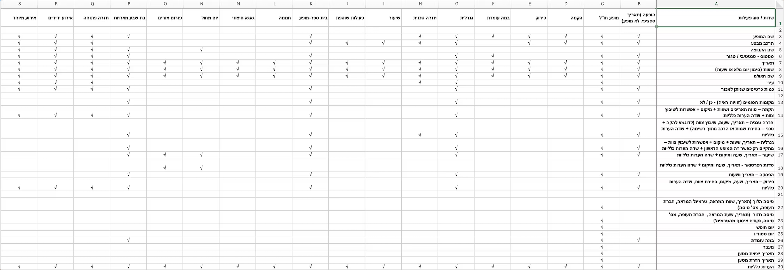
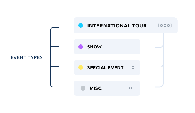
Common Ground, Key Difference
Classification
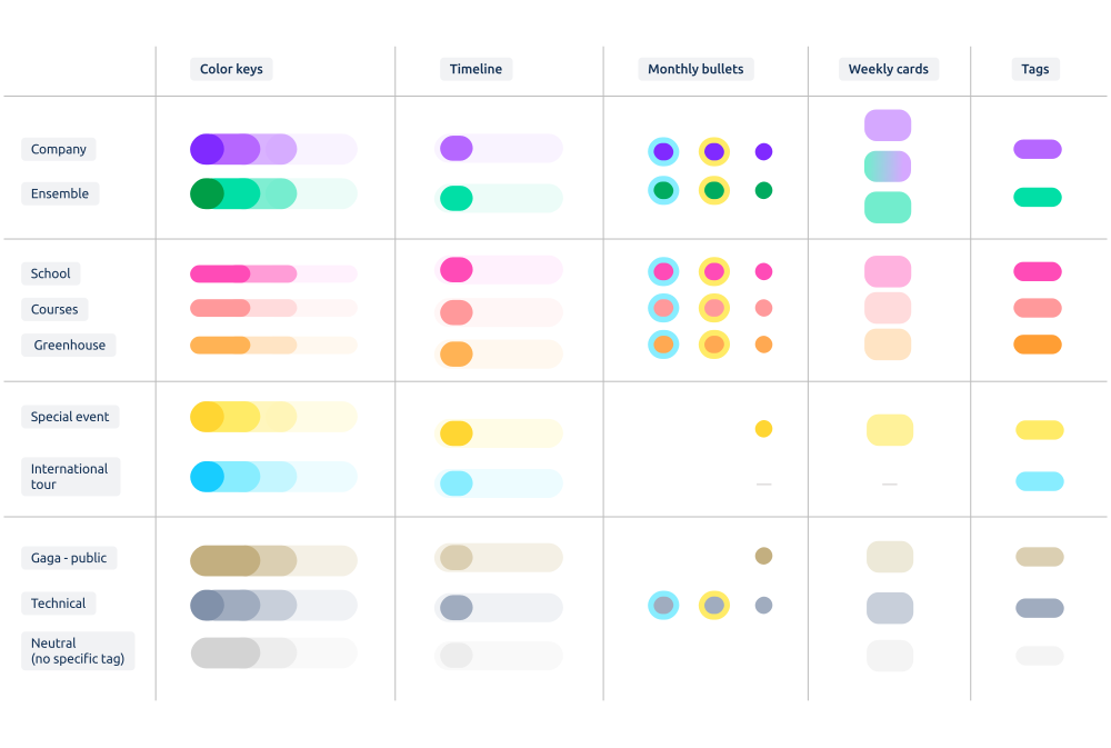
Establishing a logic using colour codes
Each ensemble needed a consistent identifier. But some events crossed categories - an international tour isn't just "who," it's also "where" and "what kind." Each layer needed its own signal without collapsing the logic of the whole.
What I built was a classification language: ensemble as the base identifier, with modifiers for international, technical, and special events - so a single calendar item could carry multiple layers of meaning without becoming noise.
What I built was a classification language: ensemble as the base identifier, with modifiers for international, technical, and special events - so a single calendar item could carry multiple layers of meaning without becoming noise.