
CHALLENGE01
Architecture
Finding the system story
Defining the Problem
Important data was fragmented, and lost in the clutter
The player page was overloaded with information - training data, injury predictions, load metrics, past injury history. Everything was there, but buried. Users didn't know where to start or what mattered.
Discovery
What story is this page trying to tell?
The page threw every information type at users at once - what's critical, how to apply it, what the bottom line is. No mental model to anchor any of it. So I worked backwards: every data point had a reason someone needed it. I traced each one to the decision it served. Those needs became the structure.
User centered narrative
Restructuring the page
Instead of a wall of numbers, the page became a mini-dashboard where key insights surface naturally and the layout guides users toward action.
New form
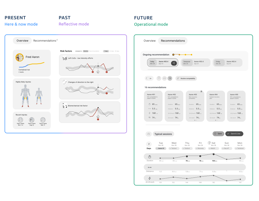
One page, three modes of reading
The redesign split the page by intent. A here-and-now glance for a quick read on where the player stands (present). A reflective view for spotting trends over time (past). An operational mode for acting on them (future). Same underlying data, surfaced three different ways - depending on whether the coach came to check, to understand, or to decide.
CHALLENGE02
Simulator
Turning tedious tasks into play
Problem framing
The interface was blocking its own purpose
The Simulator is a "what-if" tool that lets coaches test different training scenarios and forecast impact on players' physical state.
The existing interface was a table of input fields - manual data entry across multiple parameters. This wasn't just tedious; it was cognitively expensive. Each scenario required filling out fields, waiting for calculations, then starting over.
The existing interface was a table of input fields - manual data entry across multiple parameters. This wasn't just tedious; it was cognitively expensive. Each scenario required filling out fields, waiting for calculations, then starting over.
Approach
Starting with mechanics, discovering the strategy
The first iteration went after the obvious friction: make editing faster. I replaced manual typing with sliders, and added group selection so coaches could adjust several values at once. It made the tool easier to use - fewer steps, less effort per scenario.
But it didn't make it the right tool. I was smoothing the surface of a workflow without asking what the tool was really for.
But it didn't make it the right tool. I was smoothing the surface of a workflow without asking what the tool was really for.
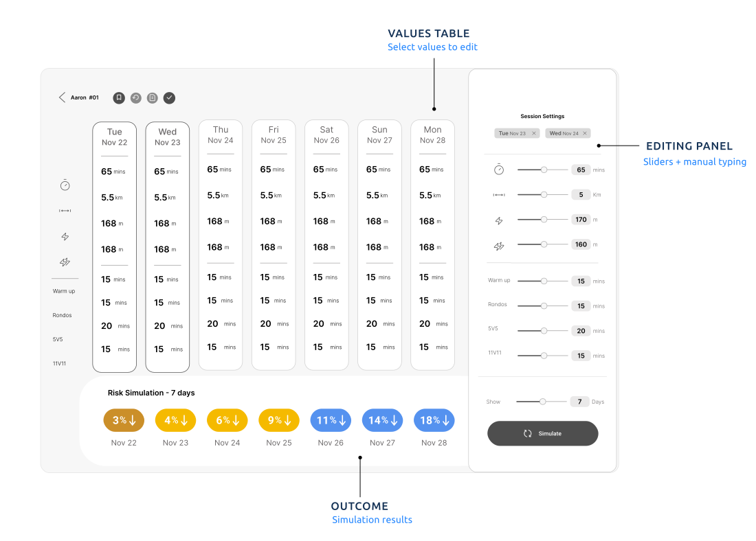
The center of gravity here was still about managing selections. but the essence of the tool wasn’t "easy data entry", it was enabling exploration and discovery
Ping moment
It's not about the numbers - it's about the relationships between them.
Insight Reframing
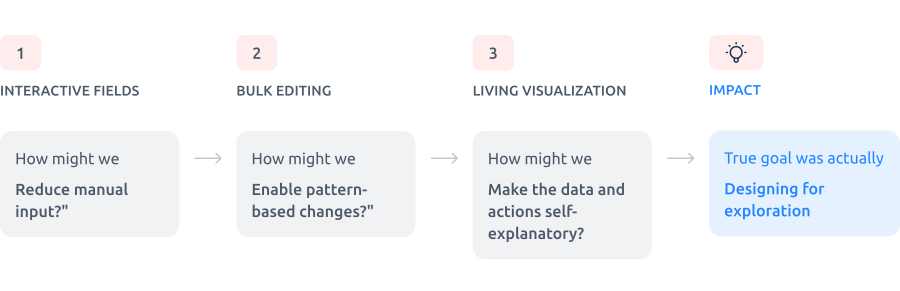
The goal was now redefined: design a tool that will help coaches explore scenarios, and creating potential training plans. looking at the simulator from that perspective, I realized that the individual numbers weren't what mattered. What mattered were the relationships between them. The trends. The proportions.
The new interface tried to let users manipulate factors - "increase this training type by 20%". Users think in their domain language; the interface translates to data.
The new interface tried to let users manipulate factors - "increase this training type by 20%". Users think in their domain language; the interface translates to data.
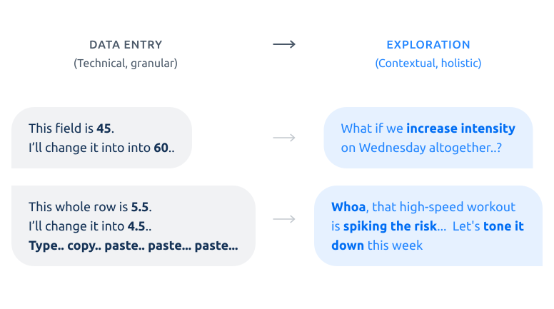
"Increase intensity", "Add recovery", "Adjust the weekly plan". Users just nudge the scenario directly - and see what happens. The system handles the math. The numbers are just a byproduct.
Shift
From granular (field-by-field) to holistic (pattern-based)
The interaction model moved from editing values to nudging scenarios.
Before: "This field is now 45, I'll change it to 60." "This whole row is 5.5, I'll change it to 4.5 - type.. copy.. paste.. paste.." Coaches worked one number at a time.
After: "What if we increase intensity on Wednesday altogether?" "That high-speed workout is spiking the risk - let's tone it down this week." They work in scenarios. The system carries the change, and the numbers follow.
Before: "This field is now 45, I'll change it to 60." "This whole row is 5.5, I'll change it to 4.5 - type.. copy.. paste.. paste.." Coaches worked one number at a time.
After: "What if we increase intensity on Wednesday altogether?" "That high-speed workout is spiking the risk - let's tone it down this week." They work in scenarios. The system carries the change, and the numbers follow.
The real goal wasn’t "easier data entry", it was enabling exploration and discovery
The interaction model needed to match how coaches actually think - in training load, recovery patterns, and weekly rhythms - not in individual numerical values. I transformed static input fields into interactive, manipulable objects
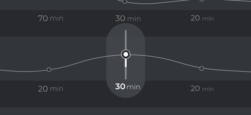
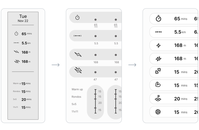
By transforming the mechanics into a "live" graph, I turned the tool into another way to understand the information - making the data legible while coaches work with it.
Making It Work
Getting into the details
Training routines were treated as bundles of 3-4 workouts grouped together. But those workouts only varied in intensity and duration. The bundling didn't reflect reality - and made adjustments harder. I broke parameters apart, treating each as standalone input. This made the system more flexible and interaction simple
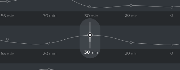
A small drag caused a huge jump
Since the Simulator uses gestures to adjust values, the scale needed to feel right. Too wide a range meant a small drag caused huge jumps. I worked with engineers to define proper value ranges and smart intervals - keeping interaction smooth and controlled.
Bottom line
Nailing the product strategy
By reducing friction, I unlocked the tool's core purpose: enabling discovery through experimentation.
The easier it is to test a scenario, the more scenarios coaches explore. This wasn't about making things "prettier." It was about understanding what the tool needs to accomplish, identifying what blocks that goal, and removing obstacles through interaction design.
The easier it is to test a scenario, the more scenarios coaches explore. This wasn't about making things "prettier." It was about understanding what the tool needs to accomplish, identifying what blocks that goal, and removing obstacles through interaction design.
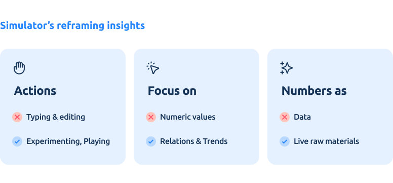
Less friction + More exploration = better insights = the product delivering its value.
CHALLENGE03
Visualization
Making complex data intuitive
Problem
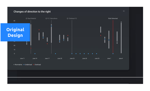
Users regularly called support asking how to read the risk graph
Coaches regularly called support, unable to interpret the risk graph. This was a critical issue -if users need help understanding the core prediction tool, the design isn't meeting its goal.
What was wrong with the graph? I approached this from two perspectives:
What was wrong with the graph? I approached this from two perspectives:
- Infographic & Visual Design: Is the data visualization clear enough? How can I improve its legibility and visual hierarchy?
- Functional Analysis: Before diving into the visuals, I needed to define the graph's core purpose. What information does it actually convey? What is its role in the user's workflow, and what specific insights are coaches looking for that they currently fail to find without support?
Challenge
How to present complex data coaches can easily understand?
The platform is full of information - risk predictions, training loads, performance metrics. The challenge: how do you present complex data in a way that coaches understand at a glance, without requiring a statistics degree?
Unpacking
What questions is the graph addressing?
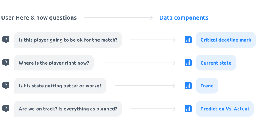
Before redesigning, I needed to define the specific decisions coaches were trying to make. I interviewed the Product Owner to understand the core user needs and the gaps in the current experience.
The primary question coaches ask themselves is: 'Do I need to adjust this player’s training plan before the match?'
Once I understood what the coaches were looking for, it became clear that the graph was presenting the wrong information. It wasn't providing the specific answers they needed to take action.
The primary question coaches ask themselves is: 'Do I need to adjust this player’s training plan before the match?'
Once I understood what the coaches were looking for, it became clear that the graph was presenting the wrong information. It wasn't providing the specific answers they needed to take action.
Mapping
When critical data becomes noise
By mapping the specific questions users ask, I identified a vital layer of risk parameters that was being "suffocated" by the primary graph. Initially, we tried layering these metrics together for a "complete picture," but testing proved that forced correlation added zero value. The users weren’t looking for comparisons; they were looking for clarity. By decoupling the data into three dedicated "sibling" views, I provided the necessary mental real estate to turn complex metrics into effortless insights.
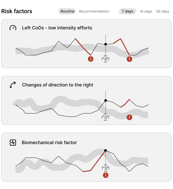
What question would a coach need to ask for the answer to be: ‘Here, by comparing these three parameters, you can see...' ?
I looked for such a scenario and discovered it didn't exist."
Constraints
Bridging the gap between design and reality
I designed a sleek, trend-based line graph, only to discover during implementation that our real-world data was actually not what I thought: In real life measurements often were missing foe various reasons ,and we had to address that constrain. Our initial specs didn't account for inconsistent measurements. . I embraced the constraint. and pivoted the UI to a dotted trajectory, reflecting yet an additional layer of info, without having it look like a mistake.
New Mental Model
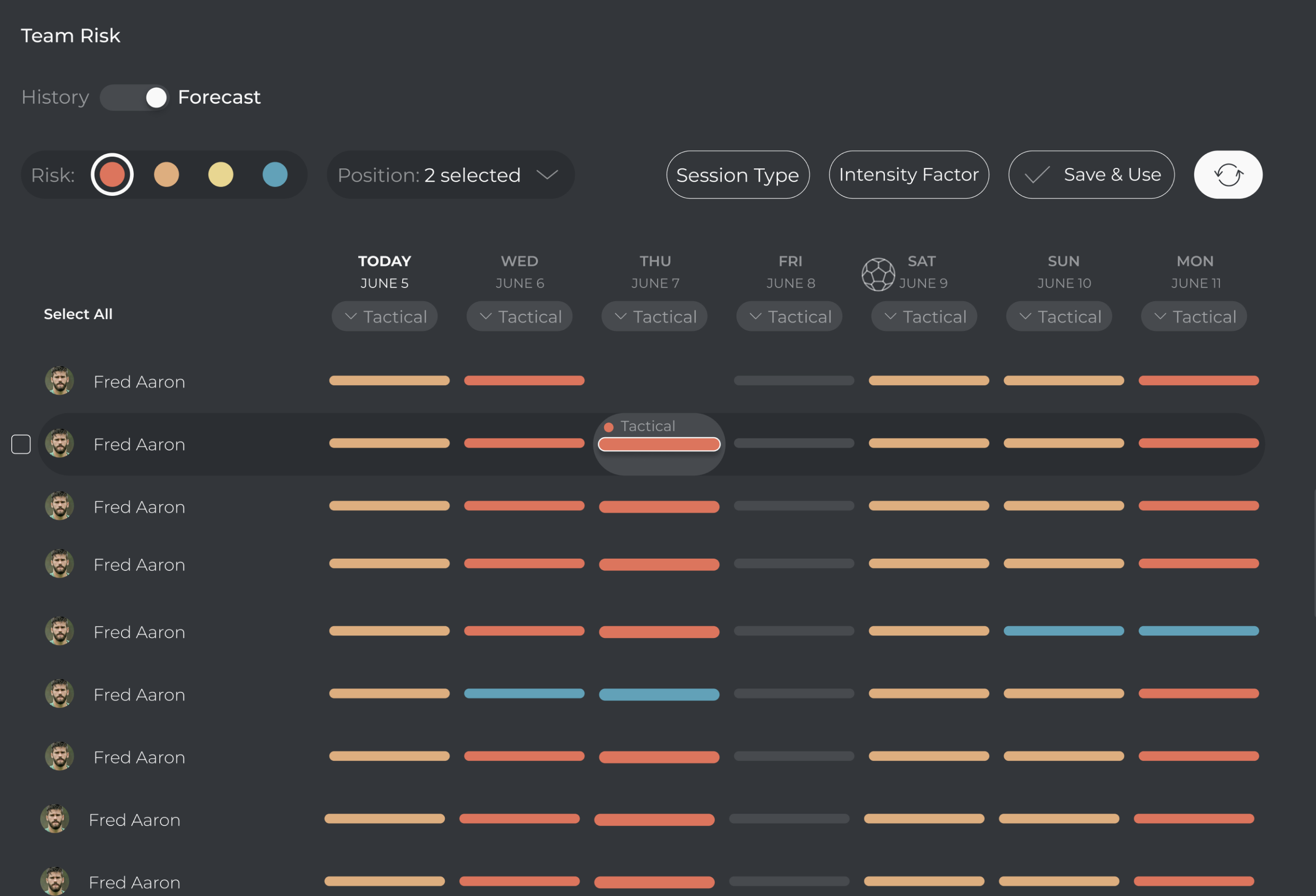
Team heat map: Scaling up from individual to team
The team-level view was supposed to show overall risk status - the whole roster, not one player. Same constraint as everywhere else: it had to live on a timeline. Risk shifts every day, and coaches need to read past and future side by side. The challenge was adding the forecast layer - turning a status display into a decision-making tool.
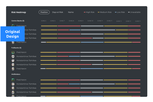
Informative display turning into an instrument
The solution evolved through three moves:
1. A mental model for past vs. future. One interface had to carry both stories without blurring the line between them.
2. Break the visual streaks into single, manipulable slots. Each day became its own unit - readable on its own, adjustable on its own.
3. Bring the simulator's mechanics into the heat map. What started as a high-level overview became a living, interactive tool. The simulator's DNA turned the heat map into a team-level simulator.
I realized there was no point in building two separate systems when the only real difference was the status. If the data is the same, the interface should be too.
Tradeoff
The mechanic was consistent and efficient enough to outweigh the learning curve
The risk (UX-wise, not the injury risk): coaches were used to seeing the heat map as a risk indicator only. Adopting this would require a new mental model. But we had already established a clear past-future narrative across the platform. Consolidating into a single mechanism wasn't just cleaner — it was consistent. The heat map became a natural extension of that narrative, not a separate tool.
By keeping the UI consistent and the data in place, I turned a redundant "double-world" into a streamlined workspace where the only thing that changes is the user’s focus.
By keeping the UI consistent and the data in place, I turned a redundant "double-world" into a streamlined workspace where the only thing that changes is the user’s focus.